Showing posts with label Things I like. Show all posts

Sunday, 23 March 2014

I got this lovely artwork from one of my favourite illustrator, Mr Bingo...
I'm on the look for a frame.

Friday, 21 March 2014

The concept of dating. Do you get it?

Illustration by British artist David Shrigley. I like the honesty in his work and his amazing sense of humour. Also a bit of darkness mixed up with a naive drawing style.

Monday, 17 February 2014

Kamil Czapiga

Amazingly detailed black and white tattoos by Kamil Czapiga:


Friday, 18 November 2011

The Manchester Connection 1976-1992

If you're in London and you have some spare time to see a small exhibition, I'd recommend you one at the Movie & Poster Art Gallery, 5mn walk from Goodge street tube station (1 Colville Place, W1).

It's open until early December and it features plenty of original artworks (framed posters & album covers) from the Manchester creative scene of the post-punk era.
You will see some great artworks designed by the very inspiring Peter Saville, who designed many many records sleeves for Factory Records. It includes bands like Joy Division, The Smiths, The Stone Roses, Morissey and so on...

You can also buy the prints. Here are few posters I would loooove to get (but unfortunately some of them are already sold out and a bit pricey):

Original Factory promo poster for Joy Division - Art Direction Peter Saville, Photography Trevor Key, Typography Brett Wickens.
Amazing work on the colours/typography and photography.


NEW ORDER - FINE TIME, 1988
Original Factory poster, 20"x30" - Design by PSA.
Dichromat: Trevor Key and Peter Saville.


THE STONE ROSES - FOOLS GOLD, 1989
Original Silvertone promo poster, 23"x16.5" - Artwork by John Squire (best known as the guitarist of the Stones Roses, great painter heavily influenced by the action painting technique of Jackson Pollock).


FACTD 50 NEW ORDER - MOVEMENT
Original CD cover proofs, 8"x13" each - Design by Peter Saville and Grafica Industria.


For more details, click here:
http://www.rock-explosion.com/manchester.html

Friday, 21 January 2011

Charles Burns is an american cartoonist with a very strong graphic style.
I like his work, hypnotic, dark and meticulous:


Friday, 10 December 2010

If you don't know what to do on a cloudy Sunday afternoon in London, visit the Somerset House in Charing Cross, for the Rene Gruau exhibition. It's on until the 9th of January 2011.
He was a fashion illustrator and he did illustrations for magazines, parisian clubs and also collaborated with Christian Dior on many advertising projects in the 50's.
He is one of my favourite illustrator; his drawing style is minimal but striking, delicate and strong, sophisticated and timeless. For a man I think he has a very surprising and feminine drawing style:


Wednesday, 1 September 2010

I discovered Ernst Haeckel's illustrations by doing some research about "Art Nouveau", a movement in the history of Art characterized by organic, especially floral and other plant-inspired motifs, as well as highly stylized, flowing curvilinear forms in the late 19th and early 20th centuries. I particularly like this movement and I'm amazed by Ernst illustrations, they are so detailed and subtile. He was a scientist and an inspiration for many artists from the "Art Nouveau" period.

Funny bat faces below. I would be scared if they were my friends.
All illustrations comes from the book "Kunstformen der Natur".

Tuesday, 18 August 2009

Jason Munn & the indie rock bands

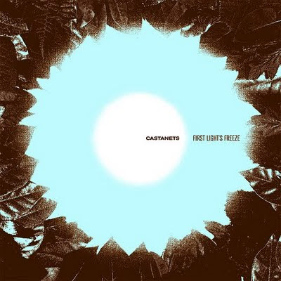
Castanets album cover designed by Jason Munn and released on the Asthmatic Kitty label. A band you must listen to and an independant label you must discover. This album cover reflects perfectly the atmosphere of this album, cold and dark like a morning in Winter.
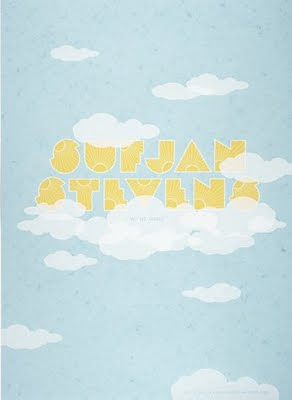


Sufjan Steven's gig poster designed by Jason Munn. I'd say these posters (on the top) reflect very well the music of Sufjan Stevens. His music is a bundle of instruments and orchestration. On stage he plays with 5 to 10 musicians and he's also part of the Asthmatic Kitty label.
But you can maybe listen to his songs: "Sister Winter" by looking at that poster or "Chicago" by looking at the next one (the clouds) which demonstrates something celestial. 2 completely different songs, one dark, one dynamic and positive like these two posters.


Conor Oberst is another very talented kid known to be part of the band named "Bright Eyes". We can imagine the musician with the hat on the poster playing some nice folk songs and telling us stories coming from his life and imagination...


I find Jason Munn's work so well composed, minimalist but with strong images. He nicely plays with the colors, the typography, the icons. The results is poetic and modern.

He started a design studio in 2003 "The Small Stakes" and his work is mostly focused in independant music. His posters became a fixture in the local independant music scene.

Reza Abedini

Persian Type and Typography-2003-100*70cm offset

Dream of Dust-2003-Film poster-100*70cm silkscreen

Victim-2005-Installation group exhibition-100*70cm offset

Reza Abedini is an iranian graphic designer famous for his modern persian typography.
He often use a limited but strong range of colours, with photography for an austere and bright effect and combines modern and traditional themes in his work, commisionned by multiple cultural institutes.

Oded Ezer, between art and typography


Oded Ezer, type and logo designer from Israel creates brilliant latin and hebreu 3D typography. It reminds me at some point Gaetano Pesce, with these organic and fascinating shapes that he creates. He also has some very nice logos in his website.

Sunday, 26 July 2009

Maxime Buechi


Maxime Buechi is a designer, editor and tattoo artist from Lausanne. He published an unique magazine named "Sang Bleu" which is a bundle of art, fashion, writing, photography and tattoos. The mock up is minimalist and avant-garde.

Gaspar David Friedrich